HealthJoy | Product Design | 2020
HealthJoy App v2
"A completely new design that’s airy, easier to read, and feels magical. Improvements to navigation, chat, and our inbox makes the HealthJoy app a true joy to use."
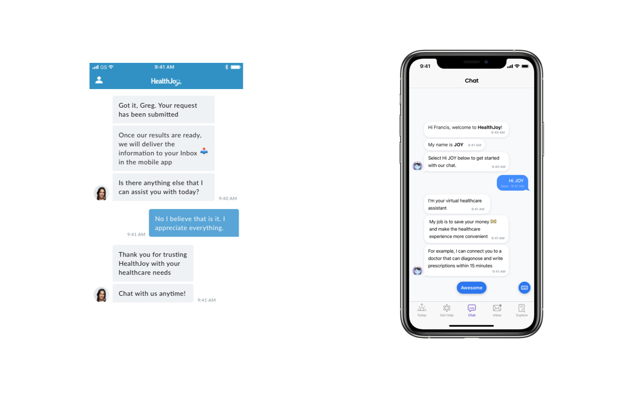
A Complete Redesign
Our users were experiencing an aging app that didn't reflect current design patterns and wasn't easy to use. I dove in with extensive user testing that led to the determination that users wanted HealthJoy to feel fresh, but restrained. Beautiful, but human.
I led our design team by generating a set of principles to guide design, a design system to stay consistent, and user feedback to ground the team. This effort led us to designs that not only felt fresh and exciting, but familiar and easy-to-navigate.
Old is New
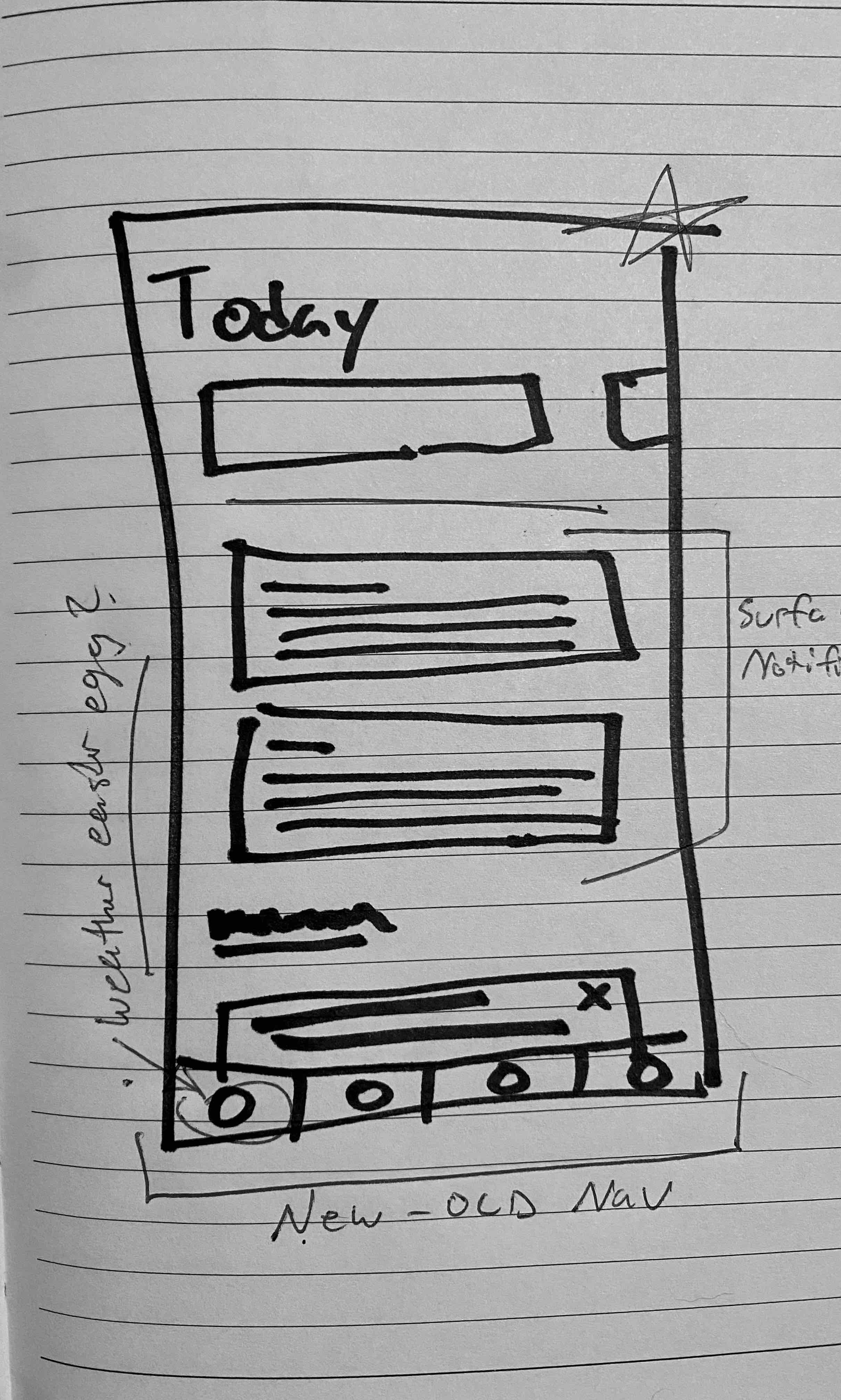
It only took me a few minutes into my first day to get some very important feedback: "Our navigation is great for people who get Tinder; our user base doesn't know what Tinder is." It was clear that the way HealthJoy approached navigation was flawed – and our members' experience getting access to healthcare felt like a left swipe – even though most members wouldn't know what that meant.
As I walked through my goals for leading Design when I joined HealthJoy, I made my primary focus clear to the team:
"My first priority is making our design accessible and approachable. My last priority is making things look good – and I'm going to make things look great."
We had some really great features in the app, and more on the way, but we needed to get out of our own way and show the user what they were looking for. Simple things like adding a tab bar, respecting our platform's human-interface-guidelines, and supporting basic accessibility features made an outstanding change in our members' interactions.
Patient Progress
The large project of overhauling the app didn't happen overnight. I worked to outline a plan with project and engineering teams to put a great product out in front of our users as soon as possible. Making sure that compromises were reached where needed was important, but so was making sure that Accessibility, UX, and UI goals were accomplished as well.
Just as important as the first launch, was the work to create a list of updates we had planned post-launch. To continue adding value to our users throughout the lifecycle of the feature-set, and providing accountability and responsibility for design growth.
Areas of Focus
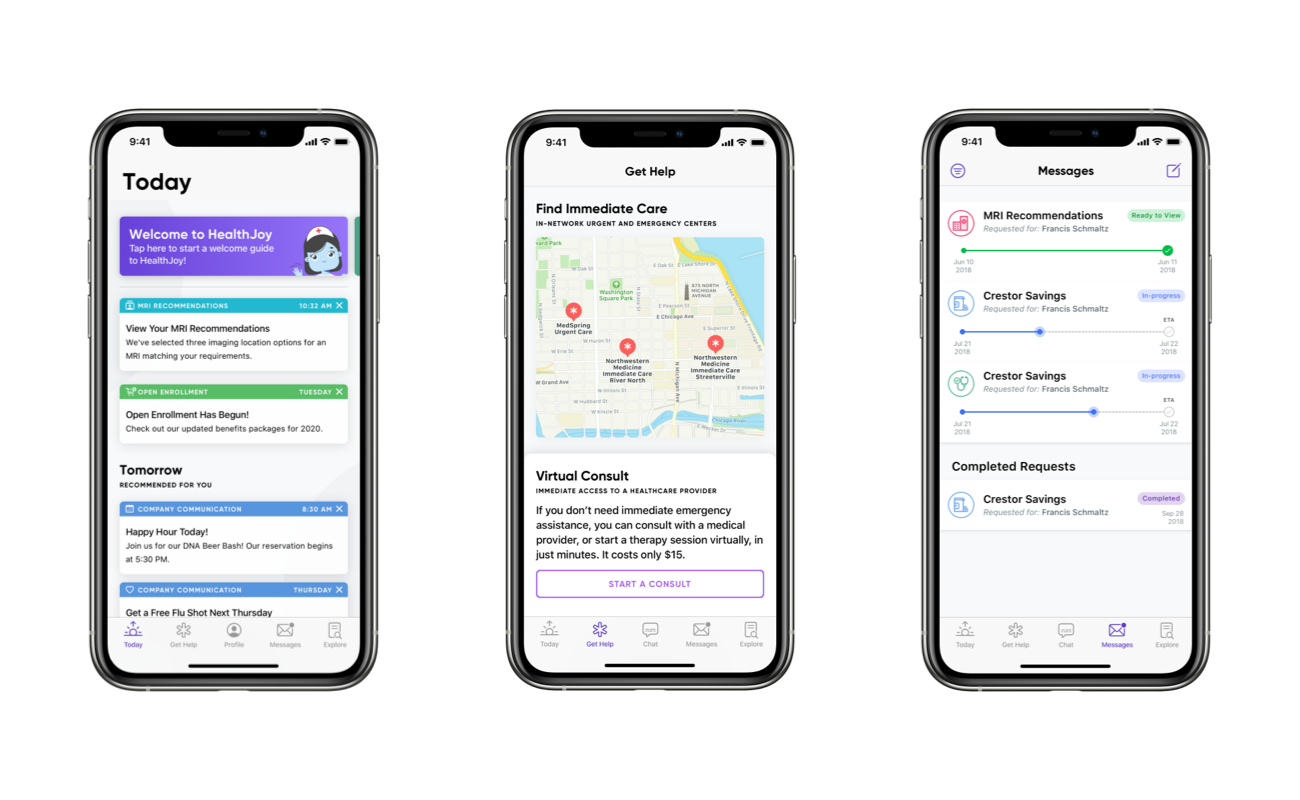
For the initial redesign I focused on four main-areas. Today, Get Help, Chat, and Messages.
While two of the sections already existed in the app, I took our data from user testing and was able to discover: Users wanted more freedom while exploring the app and approaching healthcare. They expected the app to be flexible when and where they needed help.
The Get Help and Today sections put a main focus on what the user needed right away. They didn't have to tap through menus, read old messages, or make decisions about things that might be important later. We put their content up front, and made sure they could get exactly what the needed in two taps.
Results
The updated design was reviewed by users and tested to show an increase in initial understanding and ease of navigation. As the app felt more comfortable, users found it easier to navigate and explore – this led to more time in the app and more positive experiences delivered.
My Roles
Product Design Lead
User Research Lead
Partners
Product Management
Data & Analytics Team
Engineering Team
Platforms
iOS
Android